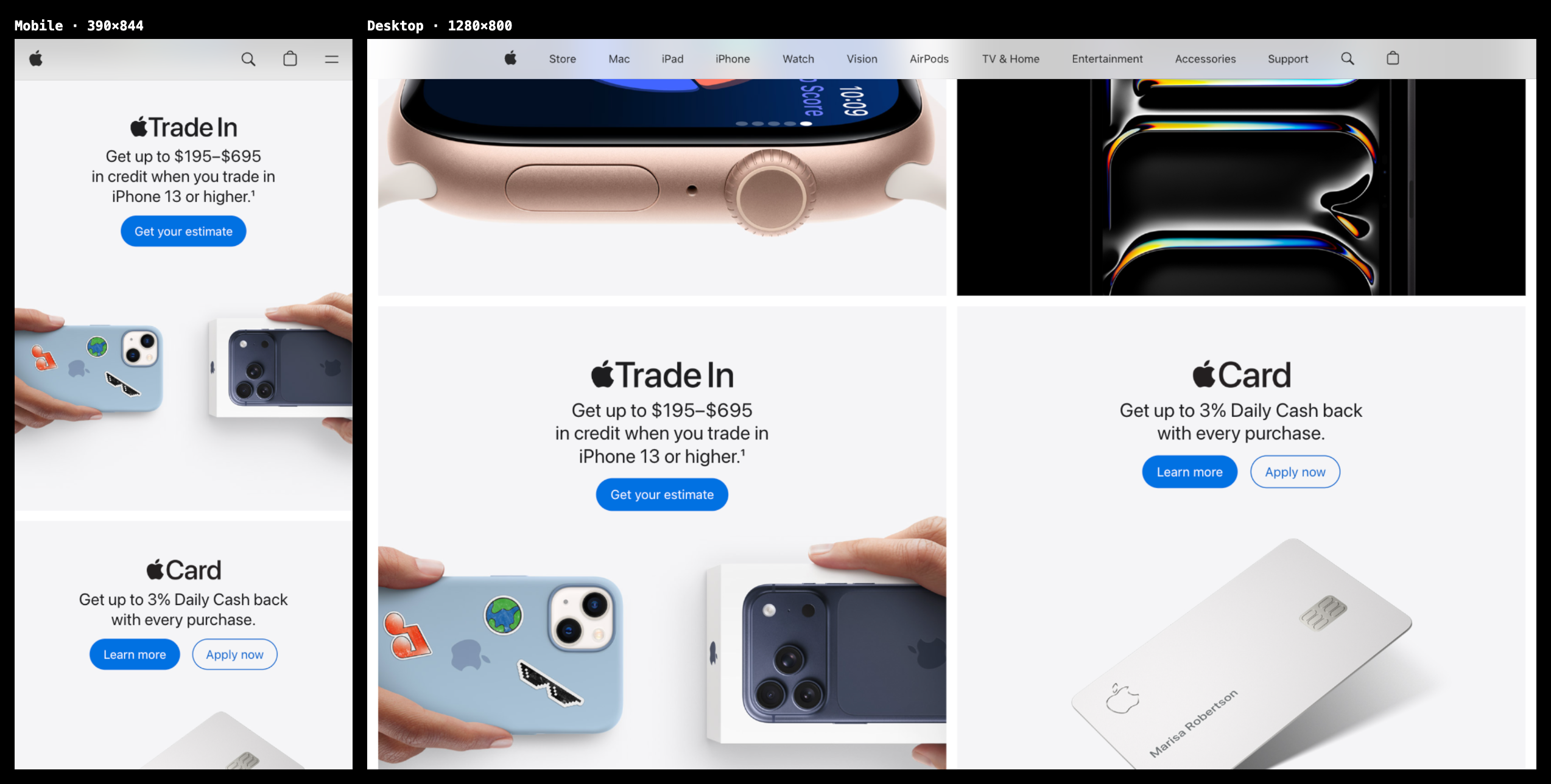
Splay every full page on one canvas.
Flip to Board and each breakpoint's entire page lays out edge to edge on an infinite pan-and-zoom canvas — captured, stitched, and ready the moment you switch.
Every breakpoint, side by side
Mobile, tablet, desktop, and an optional ultrawide — each rendered at its true device width so real breakpoints actually fire, then scaled to fit. Collapse any you don't need, or fit the window so one renders at 100%.
Section-locked scroll sync
Scroll one viewport and the rest follow — matched by section, not raw pixels, so the same content stays aligned even when a mobile page is twice as tall. Click a link in one and they all navigate together.
Works with anything — even localhost
Built on a real browser engine, so it loads your localhost:3000 dev server and any live site — no iframe or X-Frame-Options limits. Tabs, a per-tab address bar with history, and one-click side-by-side screenshot capture.

Michael Henry
Builder & creative. I made Breakpoint because checking responsive layouts one width at a time is slow — I wanted to see them all move together.